Colors & Mediums 101: A Guide for Everyday Interiors
Choosing the right art for your home isn’t just about picking something pretty—it’s about selecting the right colors and mediums to complement your space, influence mood, and express personality. Whether you're designing a serene bedroom, a vibrant entryway, or a calming office nook, understanding color psychology and artistic mediums can help you make confident, intentional choices.
Let’s break it down—simply, practically, and room by room.
Color Psychology: How Art Shapes Mood 🎨
Different colors trigger different emotional responses. Before choosing art, ask yourself: How do I want this space to feel?
Blues & Greens: Calming, refreshing. Bedrooms, bathrooms, offices.
Neutrals (Beige, Taupe, Soft Grey): Grounding, subtle, sophistication. Living rooms, dining areas.
Warm Tones (Terracotta, Ochre, Blush)Cozy, invitingEntryways, kitchens, lounges.
Bold Colors (Red, Teal, Mustard, Black & White Contrast): Energizing, expressive. Hallways, game rooms, accent walls.
✅ Design Tip: If your furniture is neutral, use art to inject personality. If your space is colorful, opt for artwork that balances or softly mirrors those tones.
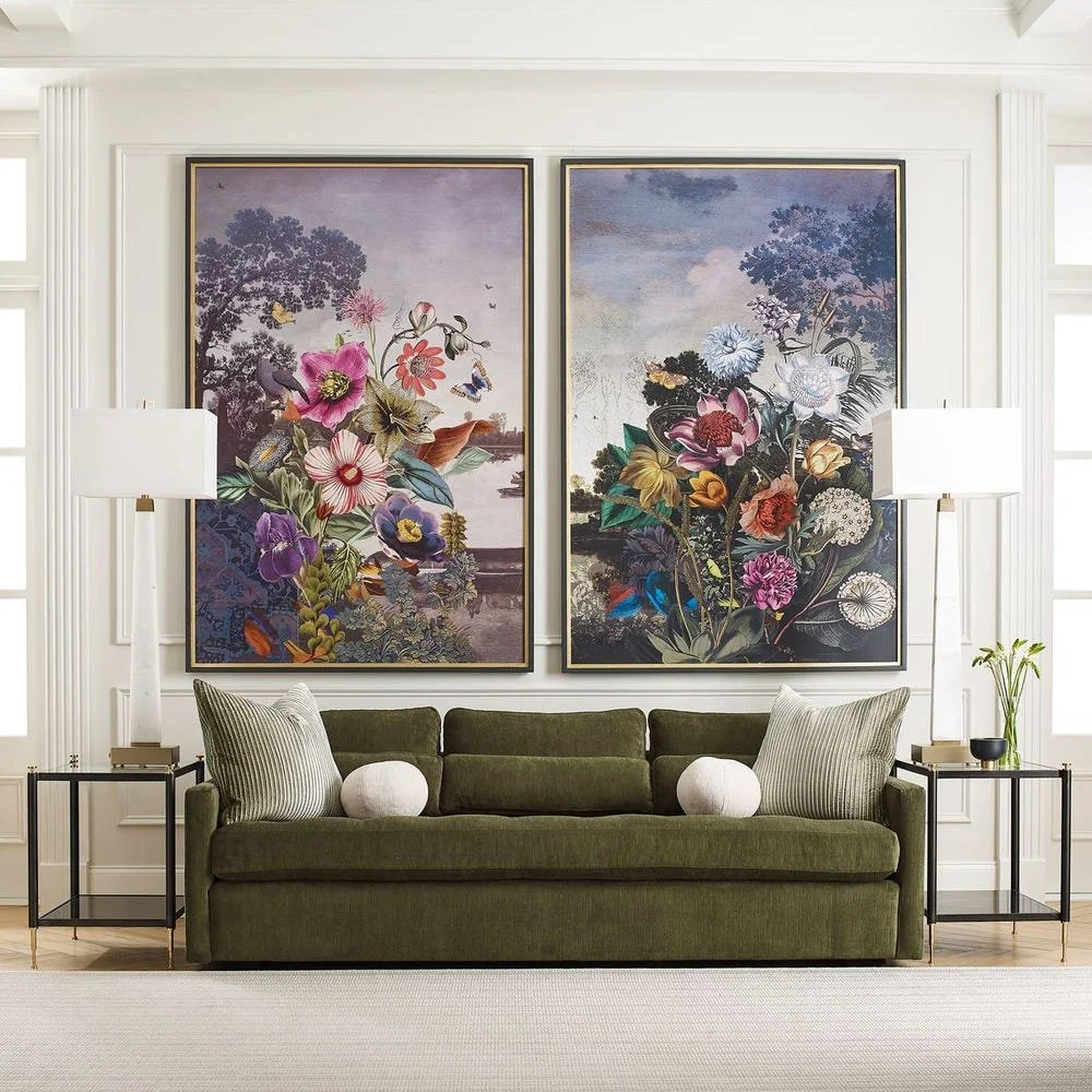
Tranquil Garden Fantasy Framed Print: Revelation by Uttermost
SKU: R45103
Art Mediums Explained: What’s the Difference? 🖼️
Not all art finishes are equal—and the medium you choose can completely change how it interacts with light, texture, and scale in your room.
Canvas Prints
Matte and soft in appearance
Ideal for large-scale artwork and relaxed interiors. A great choice for casual, modern, and versatile spaces.
Glass-Framed Prints
Polished with a subtle reflective finish
Perfect for contemporary or formal settings where clean lines and a refined look are desired.
Hand-Embossed / Textured Art
Raised or dimensional surfaces
Adds depth and visual interest, especially in minimalist rooms that benefit from subtle detail.
Mixed Media / Layered Collage
A blend of paint, paper, or fabric
Best for artistic, eclectic interiors and statement-making walls.
Wood or Linen Backdrops
Natural textures with warm undertones
Complements organic, coastal, and rustic styles with an earthy, grounded feel.
Metallic Foil or Leafing
Accents in gold, bronze, or silver
Introduces glamour and luxury—ideal for focal pieces that add drama and shine.
✅ Design Tip: If your room lacks architectural details, texture in art can act as visual architecture—layering in warmth and movement.
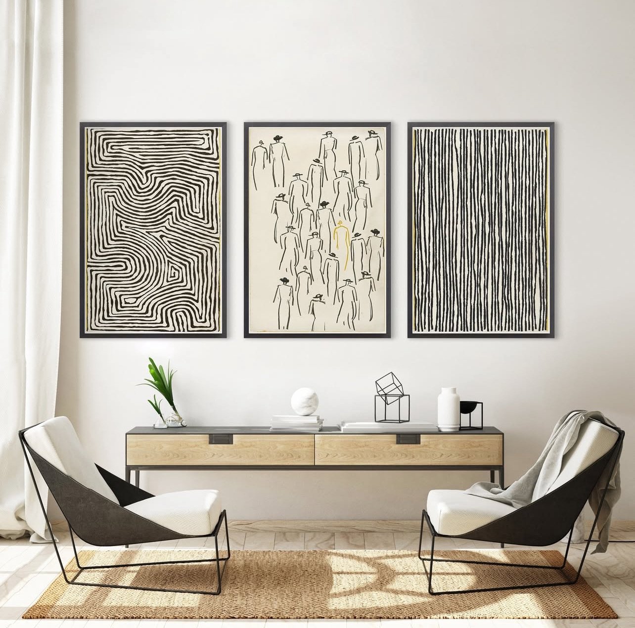
Maze, One Man, Line (available in 2 sizes): Celadon Art
How to Choose the Right Combo for Each Space 🏡
Here’s a quick guide based on common interior vibes:
Minimal & Modern
Suggested colors: Black, white, slate, and muted neutrals
Recommended mediums: Glass-framed prints and bold line art for a clean, graphic look
Coastal / Relaxed
Suggested colors: Soft blues, sandy neutrals, and light washes
Recommended mediums: Canvas, linen textures, and watercolor styles to keep the space airy
Warm & Cozy
Suggested colors: Earth tones, terracotta, and warm neutrals
Recommended mediums: Wood-framed art and mixed media for added depth and comfort
Glam / Luxe
Suggested colors: Deep jewel tones and metallic accents
Recommended mediums: Gold foil, glass, and oversized statement pieces for drama and polish
Boho / Artistic
Suggested colors: Muted pastels paired with warm brights
Recommended mediums: Layered collage and textile-inspired prints for an expressive feel
Final Thought
Art doesn’t just fill a wall—it finishes a room. When you understand how colors influence mood and how mediums influence texture and tone, selecting artwork becomes less overwhelming and more intuitive.
Whether you love soft neutrals or bold statements, every space deserves a focal point that tells a story.
✨ Start with one question: How do you want your space to feel?
Your answer will guide everything from color to canvas.